Layout Components
Expandable Panel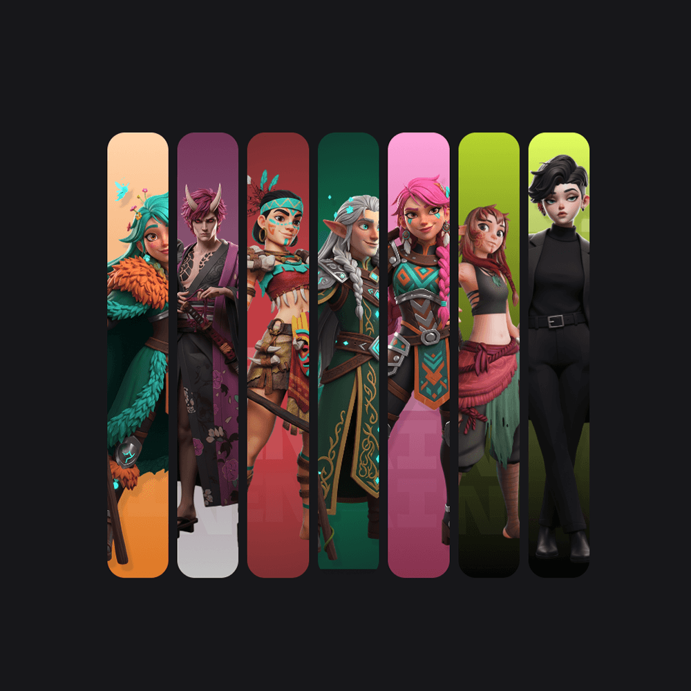
Expandable Panel
Interactive panels that expand on click with smooth animations.

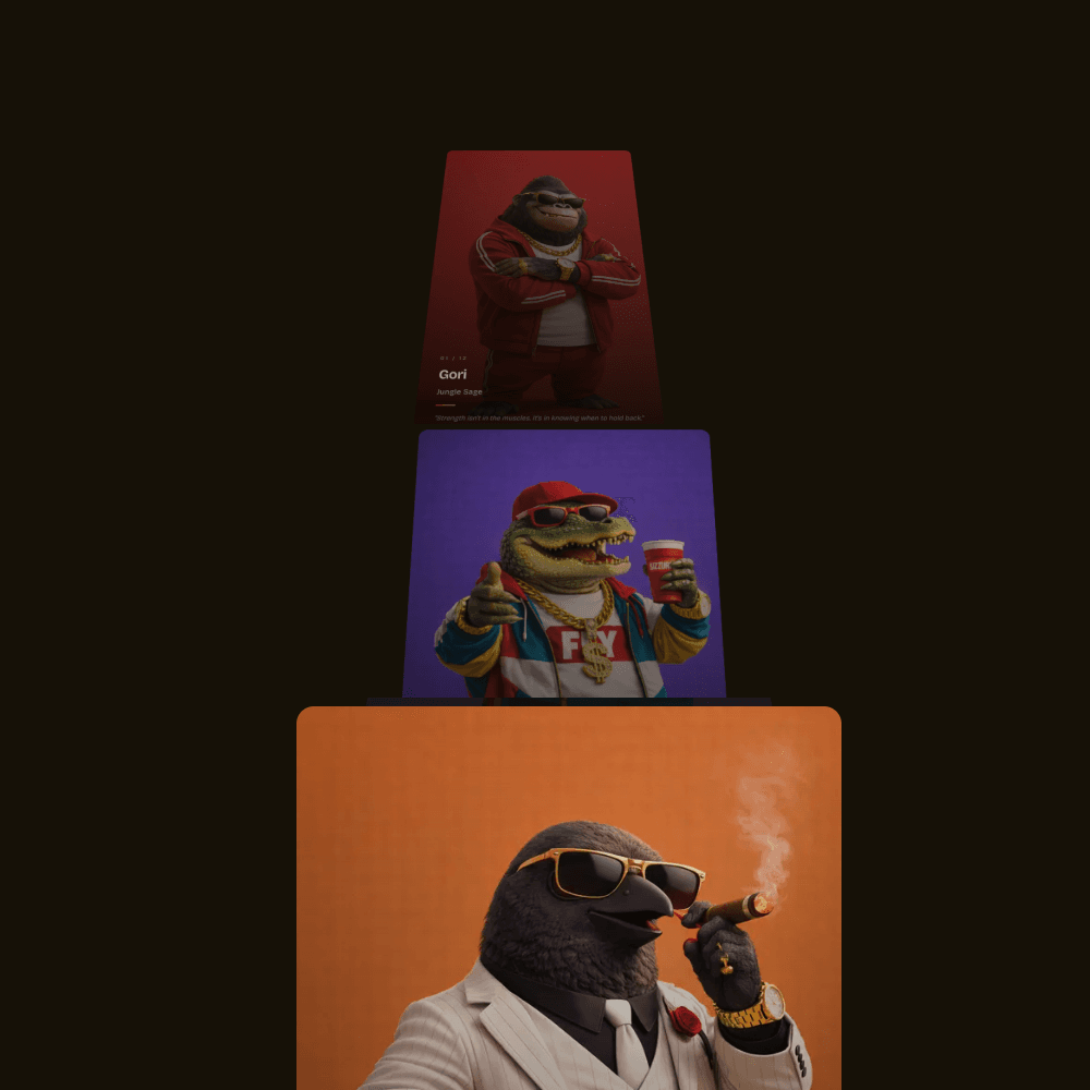
Image Gallery
Interactive circular gallery with drag-to-spin functionality.

Scrolling Gallery
Smooth scrolling gallery with parallax effects and dynamic height.

Liquid Image Reveal
Organic fluid reveal effect using SVG filters and GSAP animations.

Mouse Tilt Card
3D tilt cards with glare effects that respond to mouse movement.
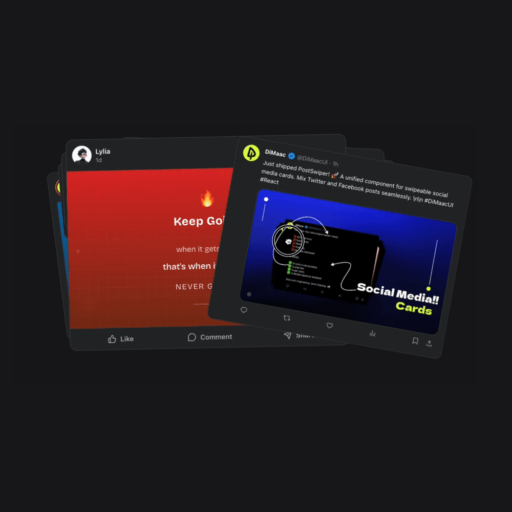
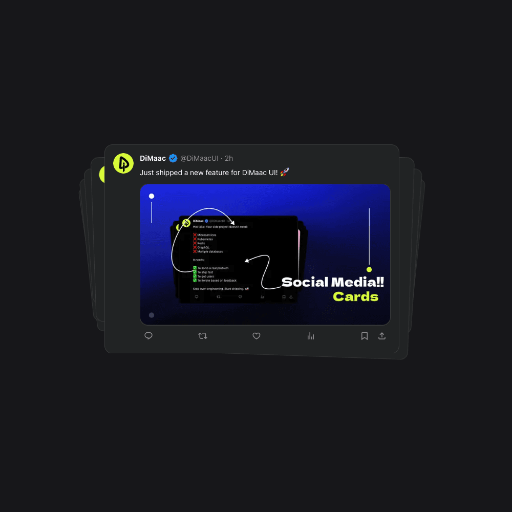
Post Swiper
Unified swipeable component for social media cards with smooth gestures.

Swipeable Cards
Touch-friendly card stack with smooth swipe gestures.
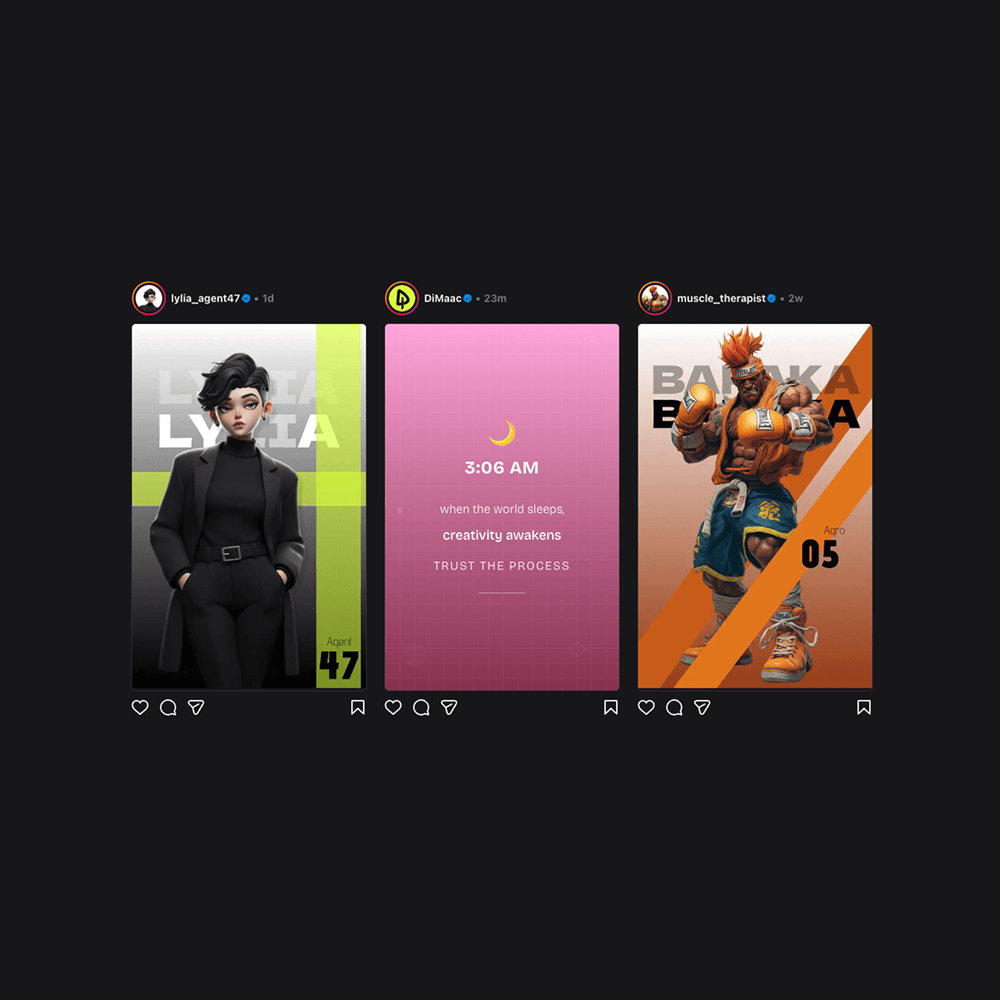
Instagram Post
Instagram post card with profile image, verified badge, and username.
Twitter Card
Twitter/X post card with interactive elements, animations, and authentic styling.
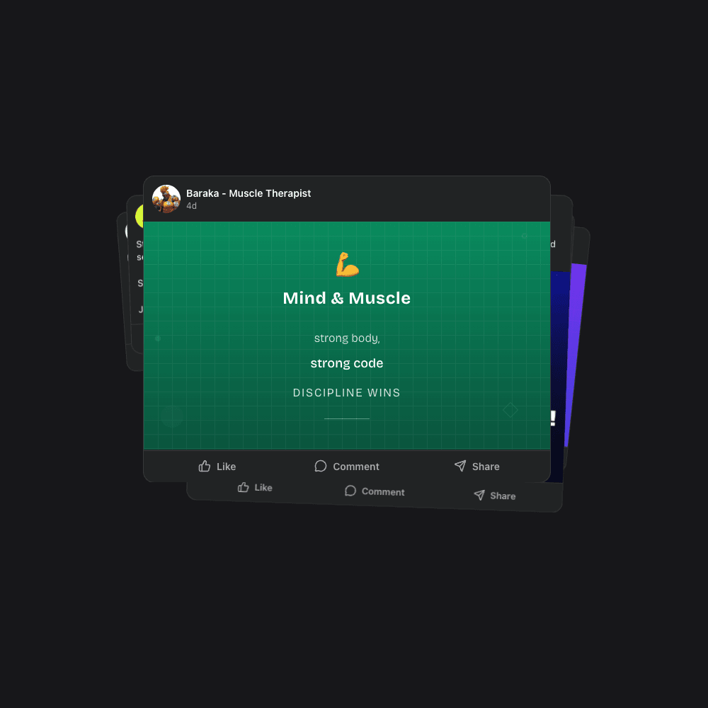
Facebook Card
Facebook post card with profile, content, and interactive like/comment/share buttons.
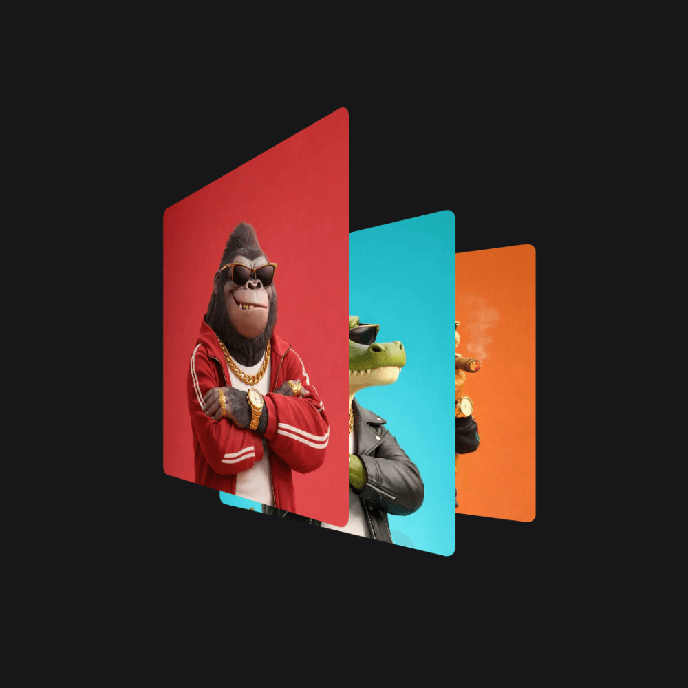
Perspective Card Stack
3D card stack that fans out on hover with perspective transforms.
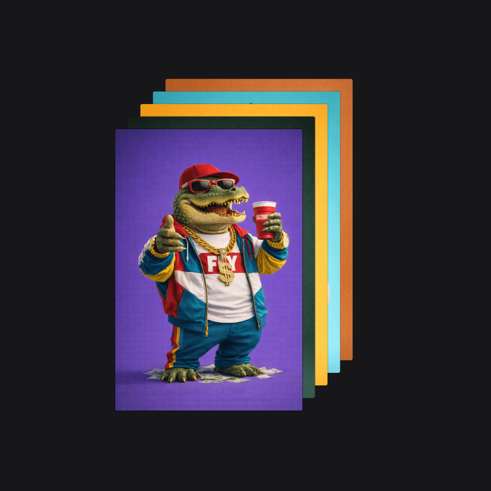
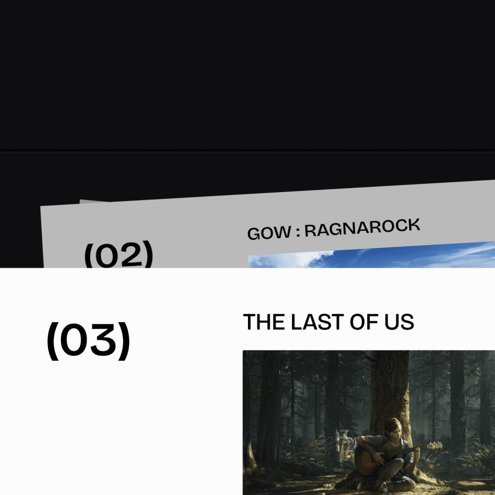
Stacked Card Slider
Click to cycle through stacked cards with GSAP Flip - clone, hide, onEnter/onLeave.

Mouse Trail
Dynamic image trail that follows your mouse cursor.

Context Menu
Right-click context menus with GSAP animations and smart positioning.
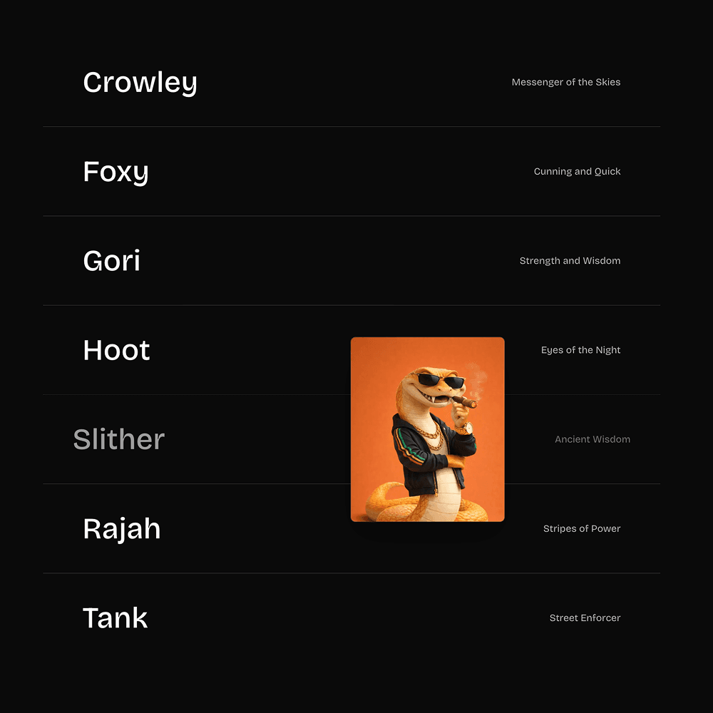
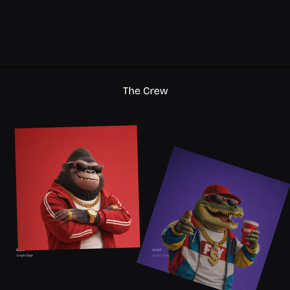
Project Hover Section
Project list with hover-to-reveal floating thumbnails that follow your mouse. Mobile: tap-to-expand.
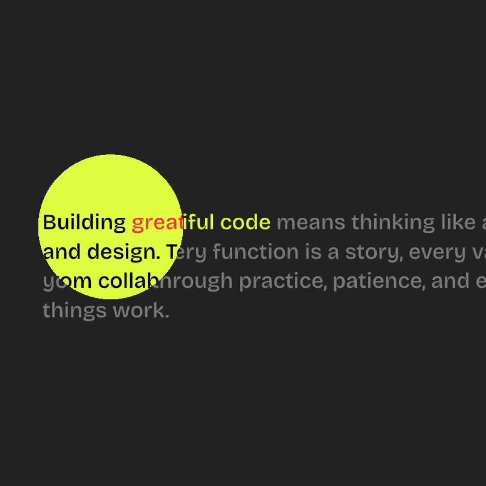
Mask Reveal on Hover
Circular mask follows cursor to reveal alternate content. Mask grows on hover, shrinks on leave.
Pin Rotate Sections
Full-page scroll: pinned sections scale, rotate in 3D, and fade as you scroll. GSAP ScrollTrigger.
Proof Of Work
Grid of works with scroll-triggered reveal: rotation, y-offset, opacity. Staggered on desktop.
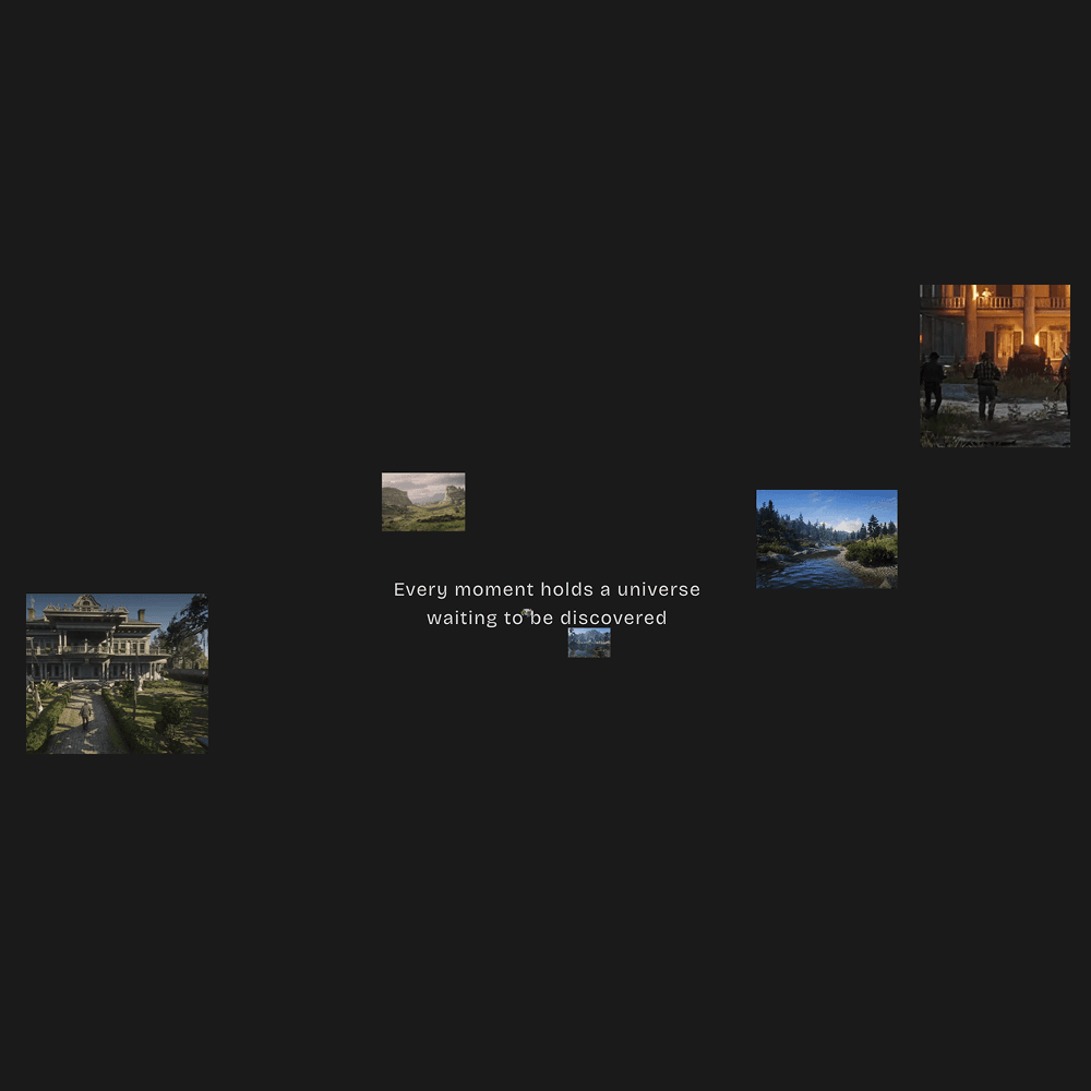
Images Flow
Pinned section: images flow from center into 3D spread. Intro, flow, outro.
Section 3D
Pinned cards fade, lift, tilt back as you scroll. Simple intro + 3D scroll.
Flow Art
Colorful sections pin on scroll. Containers rotate in from 30° as you scroll.

Text Loader
Animated text loader with gradient reveals and smooth transitions.

Text Scramble Reveal
Interactive text that scrambles on mouse proximity with custom characters.
Text Block Effect
Scroll-triggered line reveal. Colored block sweeps in, text appears, block sweeps out.